But it is time for me to post again. Here are some pictures of UV's.


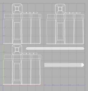
The top railing. This could easily be a part of the main building but as birds are known for hanging out at the top of buildings, this seemed like a place for its own texture.
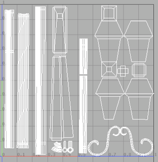
 The pipes & lantern. The lantern is very low-rez at the moment and if it has any prominence in our shots will surely be art directed with more care than its gotten so far. This works for now though.
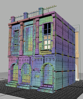
The first pic shows building two with a UV layout texture applied to it. The texture is hella ugly by most standards, but it's designed to make laying out UV's easier. The grid pattern & color cycle work as a visual guide, showing you how your UV's look on the model, where there's stretching, relative scale, etc.
I've broken this building up into 6 texture groups. One texture for the main building, one for the three lower doors & steps, one for the top railing, one for the windows, one for the pipes & lantern and one for the signs. This texture assignment is somewhat arbitrary as our shots aren't blocked out yet. I wouldn't be surprised if, on a shot-by-shot basis, the texture sizes & assignments change pretty dramatically. For background shots, for example, this whole building could be taken care of with one camera projection. On a close-up, any one door or window might actually need multiple textures.
I only screengrabbed pics of three textures but they're all there, on all three buildings. Laying all of these out like this was pretty tedious but it gives us the flexibility we'll need later on.
Cheers.

No comments:
Post a Comment